The original opening crawl
If you have no idea what I’m talking about… this is the original opening crawl from 1977:
youtube.com/watch?v=7jK-jZo6xjY
HTML
Let’s start with a very basic markup to recreate this with web technologies:
An article element holds all the other elements
The audio element is used to play the opening crawl sound
Specifying the preload=“auto” attribute preloads the audio file
Some browser support mp3 and some ogg, so I add both via source (only the supported format gets loaded)
Different subparts are split into sections
start - Opening screen to start the animation
intro, logo, titles - The parts of the animation
The animation itself is encapsulated in a div for syncing purposes (audio & animation)
<article class="starwars">
<audio preload="auto">
<source src="https://s.cdpn.io/1202/Star_Wars_original_opening_crawl_1977.ogg" type="audio/ogg" />
<source src="https://s.cdpn.io/1202/Star_Wars_original_opening_crawl_1977.mp3" type="audio/mpeg" />
</audio>
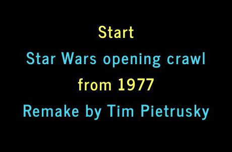
<section class="start">
<p>
Start <br> <span>Star Wars opening crawl</span> from 1977
</p>
</section>
<div class="animation">
<section class="intro">
A long time ago, in a galaxy far,<br> far away…
</section>
<section class="logo">
<svg></svg>
</section>
<section class="titles">
<div>
<p>
It is a period of civil war.
</p>
<p>
During the battle, Rebel
</p>
<p>
Pursued by the Empire's
</p>
</div>
</section>
</div>
</article>
SCSS
The next thing to do is to add some SCSS for the markup. But I’m just going to show the most important parts.
Sections
All sections have the same default properties.
section {
  position: absolute;
  top: 45%;
  left: 50%;
  z-index: 1;
}
Intro
It contains the famous sentence A long time ago, in a galaxy far, far away and is animated like this:
- Initial: hidden
- Show it and wait
- Final: hide it
.intro {
  opacity: 0;
  animation: intro 6s ease-out 1s;
}

@keyframes intro {
  0% {
    opacity: 0;
  }
  20% {
    opacity: 1;
  }
  90% {
    opacity: 1;
  }
  100% {
    opacity: 0;
  }
}
Logo
After the intro is hidden, the SVG Star Wars logo kicks in.
commons.wikimedia.org/wiki/File:Star_Wars_Logo.svg
The animation goes like this:
- Initial: hidden
- Scale (big) & show it
- Keep showing it and scale it down
- Final: hide it
.logo {
  opacity: 0;
  animation: logo 9s ease-out 9s;
}

@keyframes logo {
  0% {
    transform(scale(2.15));
    opacity: 1;
  }
  50% {
    opacity: 1;
  }
  100% {
    transform(scale(.1));
    opacity: 0;
  }
}
Titles
Shortly after the logo is hidden the titles come in. The titles itself is a wrapper element for the text:
- Place it at the bottom of the screen
- Justify the text
- Use a transform to rotate it
Then I apply an animation to the div child element (which contains the text):
- Initial: At the bottom of the screen and visible
- Move it up and keep it visible
- Final: Move it up and hide it
.titles {
  top: auto;
  bottom: 0;
  text-align: justify;
  transform-origin: 50% 100%;
  transform: perspective(300px) rotateX(25deg);

  > div {
    position: absolute;
    top: 100%;
    animation: titles 81s linear 13s;
  }
}

@keyframes titles {
  0% {
    top: 100%;
    opacity: 1;
  }
  95% {
    opacity: 1;
  }
  100% {
    top: 20%;
    opacity: 0;
  }
}
JavaScript
I’m going to use JS (with jQuery) to do some stuff:
Control start/restart of the whole animation
Synchronize the CSS animation with the audio
To stop the animation from playing when you enter the site, I remove the div.animation from the DOM and save a reference
When the user hits the start screen, the audio is played and the animation is added to the DOM
After the audio is finished, I remove the div.animation once again
Everything you want to know is in the comments.
StarWars = (function() {

  /*
   * Constructor
   */
  function StarWars(args) {
    // Context wrapper
    this.el = $(args.el);

    // Audio to play the opening crawl
    this.audio = this.el.find('audio').get(0);

    // Start the animation
    this.start = this.el.find('.start');

    // The animation wrapper
    this.animation = this.el.find('.animation');

    // Remove animation and shows the start screen
    this.reset();

    // Start the animation on click
    this.start.bind('click', $.proxy(function() {
      this.start.hide();
      this.audio.play();

      // Add the div.animation to the dom
      this.el.append(this.animation);
    }, this));

    // Reset the animation and shows the start screen
    $(this.audio).bind('ended', $.proxy(function() {
      this.audio.currentTime = 0;
      this.reset();
    }, this));
  }

  /*
   * Resets the animation and shows the start screen.
   */
  StarWars.prototype.reset = function() {
    this.start.show();

    // Clone the div.animation
    this.cloned = this.animation.clone(true);

    // Remove it from dom
    this.animation.remove();

    // Overwrite the this.animation property with the cloned one
    this.animation = this.cloned;
  };

  return StarWars;
})();
Create a new instance
new StarWars({
  el : '.starwars'
});
Final result: my fan remake
Just click on Start Star Wars opening crawl from 1977 to watch it. Enjoy!
codepen.io/TimPietrusky/pen/AGrxGb
Thanks goes to
Craig Buckler
His amazing article helped me to create this remake of the Star Wars opening crawl.
sitepoint.com/css3-starwars-scrolling-text
Mads Cordes & Jack Rugile
They improved my article and pointed out some bugs :D Thanks!
Disclaimer
This is just the work of a fan who loves Star Wars. Please don’t sue me :D